Official Sponsor of "Clean, Old-Fashioned Hate" Since 1981
April 2005
May 2005
June 2005
July 2005
August 2005
September 2005
October 2005
November 2005
December 2005
January 2006
February 2006
March 2006
April 2006
May 2006
June 2006
July 2006
August 2006
September 2006
October 2006
November 2006
December 2006
January 2007
February 2007
March 2007
April 2007
May 2007
June 2007
July 2007
August 2007
September 2007
October 2007
November 2007
December 2007
January 2008
February 2008
March 2008
April 2008
May 2008
June 2008
July 2008
August 2008
September 2008
October 2008
November 2008
December 2008
January 2009
February 2009
March 2009
May 2009
June 2009
July 2009
August 2009
September 2009
October 2009
November 2009
December 2009
January 2010
March 2010
July 2010
September 2010

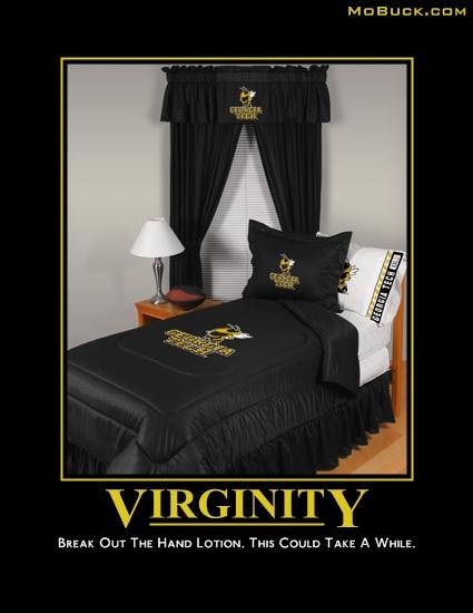
To debut the new look of the site, I wanted to kick it old school with a classic MoBuck.com poster created for Clean Old Fashioned Hate Week 2007. That way you guys can know that it may look different around here, but it's still the same old place.
Oddly enough, it works perfectly with PWD’s post entitled “Tech Straps on a New Johnson.” Ahhhh, Nerd/Sex humor. Oxymorons are fun, kids!
So hopefully you’ve noticed a few things are different around here. Let’s run through the high points, shall we?
Things that changed:
1) Three-column template: The idea is for you to say “this looks a little more organized.”
- The left column is full of links to some of my friends’ blogs that I read (almost all of them daily btw), the archives of the site, and then when I get the RSS and other feeds set up, there will be links for those at the bottom.
- The right column has a brief description of me (the newest thing is the “E-mail” me button, which should be sending e-mails to KitZeus99[at]gmail.com), then links to UGA sites, followed by links to other UGA blogs, non-UGA sports blogs, and then some Web site links that came with the template builder I used.
- The main column is obviously for the posts. The smaller width will cause some pictures from older posts to bleed over. I have a fix for that going forward, but it’d take too much time to fix the older posts. Sorry, but you have to excuse my laziness in that area.
2) The color scheme: I tried to stay as true as possible to the colors of the other template. The red is more of a dark red (I think it’s called “fire brick”) and the background is a dark blue with a small tinge of green. The reason I did that is because the previous template was easy on the eyes and I wanted this to have the same type of effect. Even though this is a blog that deals primarily with UGA sports, I found that traditional red/black with white type is VERY rough on the eyes. Anyway, I hope the readability wasn’t affected that much.
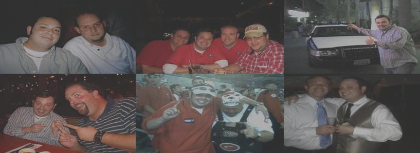
3) New banner: One thing I liked about the old template is that I had that watermark-type banner at the top with some pictures of me and friends of mine. I just built a new collage with some old and new photos. Hope you like it.
4) New links: There are some very deserving blogs that I hadn’t linked up just because it was on my “things to do” list when I changed to the three-column template. One thing I wanted to do was show which sites I read daily and, if you haven’t already figured it out, those are the ones in bold with three “***” on both sides. I also added some new blogs that I’ve found recently in conjunction with those I was already reading. The new blogs added are:
Get The Picture – We’ve discussed this plenty, but if you aren’t reading The
Good Senator every day, you’re missing out.
Dawgs Online – Written by the Zen Buddha of the Bulldog Nation, Groo, it offers more detailed insight about UGA sports. Every time I read his site, I sit back and say “I never thought about that.”
Hunker Down Dawg Blawg – Good analysis top to bottom, lots of pictures of Dawg fans doing what Dawg fans do.
Bulldogs Blog – This is the blog written by Macon Telegraph’s Josh Kendall. He updates it about 1/8 of the time that Ching updates his, but he’s getting there.
Hedge Clippings – This is the ABH’s blog. Never linked it before and meant to.
Dawg Blog – Just recently discovered this site, but it seems more news based than analysis based. Very well put together, though and a very professional looking site.Odell's BBQ -- Written by my buddy (and regular commenter) Matt T., this takes another spin on UGA football. More conversationalist than anything, which is a good thing.
The Bulldawg Blawg -- Last but not least, your source for UGA video highlights. This guy knocks it out of the park time and time again.
5) The font: Most of the larger type and the links are in “Georgia” font since I’m a dork, but the main column is in “Arial” font. On the old template, I found some of the longer posts to be difficult to read because the font was 1) so tiny and 2) not too clear. From my college days as a PR major, I found out that “Arial” font is the friendliest to the eyes on a Web site, so I went ahead and made the change as well as making it a touch bigger. Hope it’s more readable.
Known Issues:
1) Juke box is having a problem in Firefox: I don’t deal a lot with Firefox because my computer never really could support it. My comp is not super old, but the processor and RAM just couldn’t make it work. Anyway, I have been told that everything works well excluding the Juke box for the Munson Mixes. If anyone knows how to fix this, please let me know. It might be something as simple as changing the width/height in the code, but I might need to place the code in a different part of the sidebar. I’ll tinker with it some and see what I can do.
2) Photos bleeding over boundaries: Like I said, this is something that should not be a problem going forward, but it is an issue in older posts.
3) Not mobile-friendly: Most of the sites I visit, I read on my phone during the day because I make it a point to do NOTHING when I get home. I pulled up the new template on my phone and it basically does the LHC, then the main column, then the RHC, so you have to scroll down to get the post. I don’t know of a way to fix this yet, but I’ll do some reading on it. I’d also like to do some research on making a mobile version of the site anyway so that people can still check it on the go.
Ok, that should be it. Like I said, there will be some tinkering just to get some of the finer points down. The most important thing in creating the template was making the site more organized and giving other peoples’ blogs that I read a chance to be seen. The other template was NOT friendly in showing all the links I had on the site and this one is.
Above all, if you guys don’t like it, let me know. Give it a shot and let it grow on you, but if you absolutely hate it and will never come back because it’s so god-awful that your retinas are burning, please let me know. Also, if there are any other issues that I have missed in the “Know Issues” part, such as comments looking funny or Google Ads going crazy, please let me know ASAP.
Thanks in advance for the feedback and, as always, thanks for reading. Things have changed a lot from the original site and hopefully gotten better along the way. Please know that I appreciate EVERY person that reads, links, and even disagrees with what I write. It truly is a blessing when you can turn something you love into a hobby. Now if I could just land a job at the UGAA and live the dream for pay and benefits :-).
Thanks again for reading!!!!!
Until next time kids.
Be safe.
P.S. -- Special thanks to PWD who linked up the PsycHo Template Builder used to build the new site.
Labels: General "Kit" stuff, The Blogosphere
***Get The Picture***
***David Hale***
***Dawg Sports***
AJC's UGA Sports Page
A Damn Beast!!!
Battle Hymn Notes
Bernie's Dawg Blawg
Blogging Pantsless
Bubba 'N Earl
Bulldog in Exile
DawgsBUI 2.0
Dancing In The Endzone
Dawgs Online
Dawg Stephen Blog
DogBytes (ABH)
Hey Jenny Slater
Hunker Down Dawg Blawg
Leather Helmet Blog
Only In America
An Opinion On Sports
Rex Robinson's "Roughing The Kicker"
Stuff of Legend
The Bulldawg Blawg
The Georgia Bullblawg
The Grit Tree
The Hobnail Boot
The Template is generated via PsycHo and is Licensed.
Thanks for the link. Its the motivation I need